Hardware UI Design · 2025 · B2B + B2C · China Market
PetsTech Cardiac Monitor UI Design
A veterinary cardiac monitor that costs 20,000 CNY per unit. The screen is a segment LCD. Every pixel is a hardware decision. I had to make it read like a hospital monitor while keeping BOM costs survivable.
The problem
Vets need six cardiac biomarkers at a glance. The screen has zero pixels.
PetsTech builds cardiac monitors for dogs and cats. Their device measures heart rate, ejection fraction, BNP, troponin, and more. Veterinarians and pet owners both use it. One group needs clinical precision. The other needs to not panic.
The catch: segment LCDs. No app. No touchscreen. Every character on screen corresponds to a physical circuit trace on the PCB. Add a line of text, you add manufacturing cost. Remove one, you lose critical medical info. The entire UI had to be negotiated at the hardware level.
This is not software design. Every visual element I put on screen gets etched into glass. There is no undo after production.
Requirements
Everything a vet needs. Nothing the hardware can't handle.
I worked with the veterinary team to inventory every piece of information the screen had to carry. The constraint was brutal: segment LCDs price per trace, so every element I added had a dollar sign attached.
General · Heart Failure
Myocardial Injury · Arrhythmia
Age · Weight · Heart Rate
Ejection Fraction · NT-ProBNP · cTnI · Species
Dog / Cat toggle
Heart & liver status indicators
Plus a 30-minute countdown timer. All on a monochrome segment display where every character is a physical circuit trace.
Design exploration
Three concepts. Each one a different bet on what matters most.
I designed three directions and prototyped each as a real segment layout to evaluate manufacturability alongside usability.
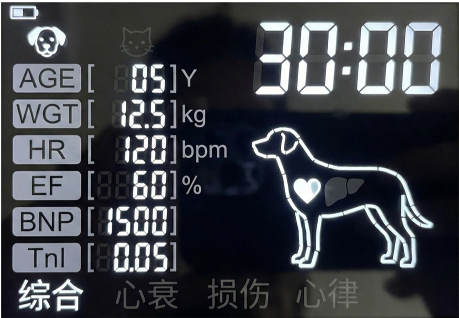
Dashboard Style
All parameters visible at once alongside a full dog silhouette with heart/liver indicators. Reads like a miniature hospital monitor.
− Cat owners see a dog outline. Requires the most LCD segments. Highest BOM.
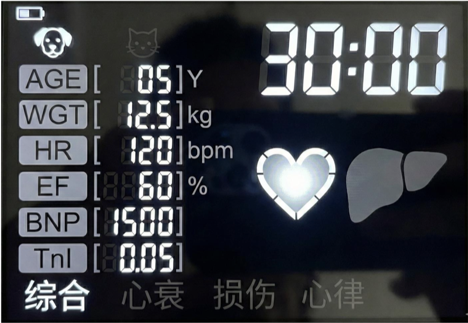
Simplified Dashboard
Replaced the dog illustration with abstract organ icons (heart, liver). Parameters stay visible. Species-neutral.
− Slightly higher cost than C. Less visual personality.
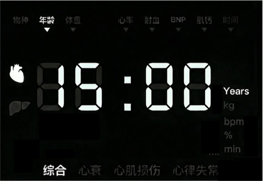
Minimalist Reuse
One large number display shared across all parameters. Users scroll through values using the top navigation bar.
− Editing requires checking three screen areas at once. Less intuitive for new users.
Evaluation
I scored each concept across six dimensions. No single winner.
The decision was not "which looks best." It was "which survives manufacturing while still being usable in a vet clinic at 2 AM."
| Dimension | A: Dashboard | B: Simplified | C: Minimalist |
|---|---|---|---|
| Intuitiveness | ★★★★★ | ★★★★★ | ★★★ |
| Info completeness | ★★★★★ | ★★★★★ | ★★★★★ |
| Visual noise | High | Medium | Low |
| Ease of use | Frequent adjusters | Frequent adjusters | Infrequent adjusters |
| BOM cost | ★ (highest) | ★★ (medium) | ★★★★★ (lowest) |
| Production complexity | High | Medium | Low |
Final design
Concept B won the evaluation. Then reality refined it further.
B scored highest on the balance of usability and cost. But the client had additional manufacturing constraints: the factory wanted fewer segment engravings to improve yield rate and lower per-unit cost. That meant the dedicated parameter fields from B had to go.
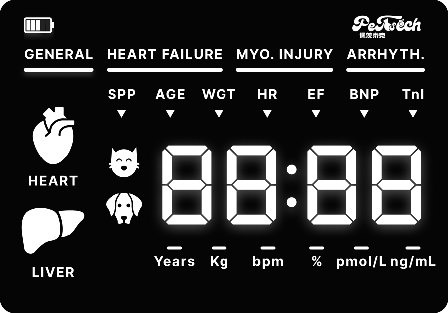
The final design borrows B's species-neutral organ icons and treatment mode bar, but adopts C's shared large number display. One big readout cycles through all parameters instead of showing them simultaneously. Fewer traces on the LCD. Fewer engravings at the factory. Same clinical information, restructured for production reality.
The result is a hybrid that neither concept predicted: B's information architecture with C's manufacturing efficiency.