Digital Product Design · Nov 2022–Mar 2023 · B2C App · US Market
Orka Digital Product Design
Hearing aids are returned more often than almost any other consumer health device. The first two weeks are make-or-break — and most products leave users to figure it out alone. This project was about fixing that.
The problem
Users were returning the Gen 1 product because the first two weeks were too hard
Wearing hearing aids for the first time takes adjustment — there's a physical adaptation period, a learning curve for the controls, and real anxiety about whether the device is even working correctly. Gen 1 had high return rates, and the root cause was clear: users weren't getting enough support in that critical early window.
For Gen 2, the goal was to design an onboarding experience that walked users through setup and adaptation — reducing confusion, reducing returns, and converting trial users into confident, long-term customers.
The device was fine. The experience around it wasn't. Users didn't know how to wear it, didn't understand what they were hearing, and had no path to professional help when they needed it.
Research & process
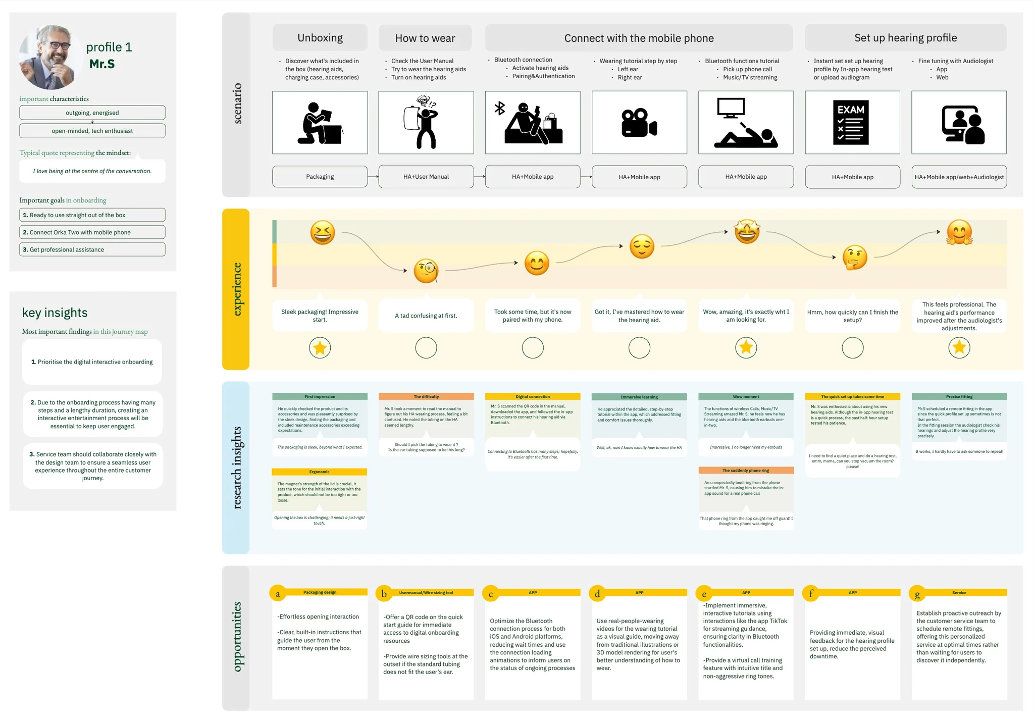
Interviews, personas, journey maps — then workshops to align across teams
The team started with user interviews to understand what actually went wrong in those first two weeks. What did people try to do? Where did they get stuck? When did they give up? From that research, we built personas and journey maps that the whole team — including industrial designers and audiologists — could reason from.
I ran cross-departmental workshops to define scope across three functional areas: Bluetooth connection, tutorial content, and hearing profile setup. Each had different stakeholders, different constraints, and different definitions of "done." Getting alignment across all three early was what kept the project on track.
Scoping
Three functional areas, each mapped to a real user pain point
From the research insights, I defined three onboarding function categories. Each one targeted a specific moment where users were getting stuck or dropping off.
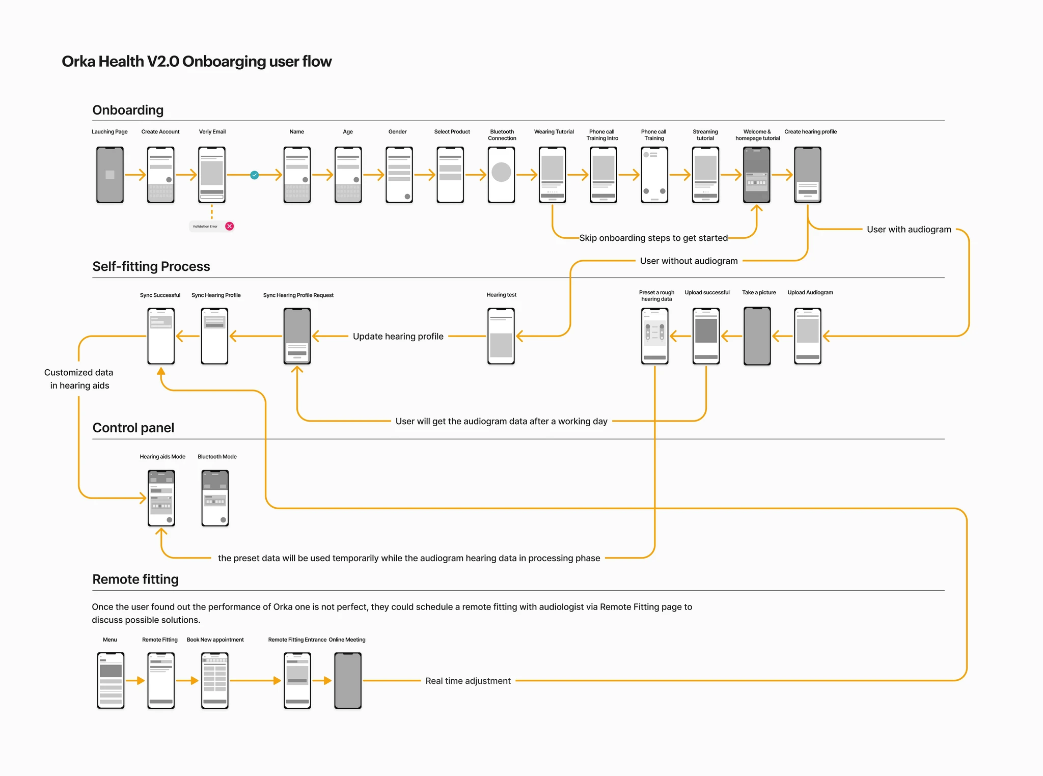
Bluetooth connection
First-time setup guide
Daily connect interaction
How-to-use tutorial
Wearing tutorial
Phone call interaction
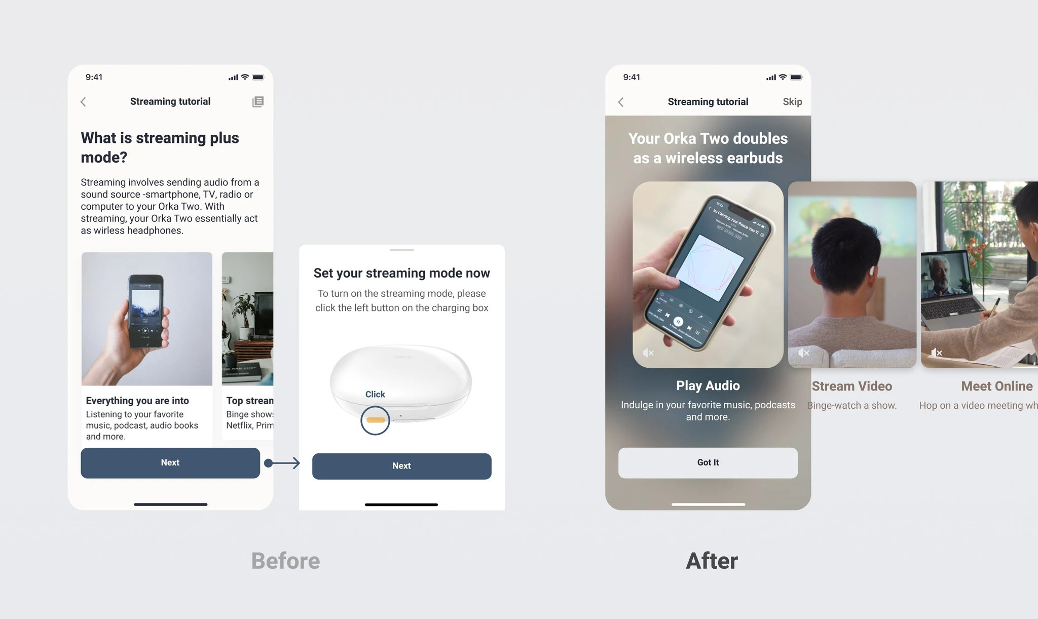
Streaming function
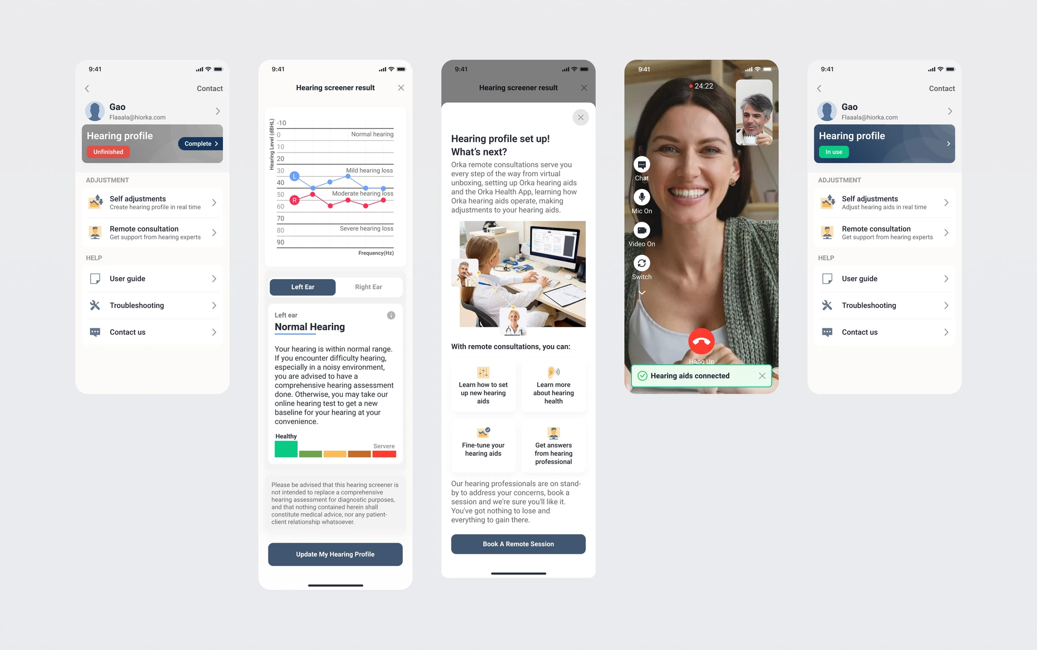
Hearing profile set-up
Program quick set up
In-app hearing test
Arrange appointments
What we designed
Three onboarding features, each targeting a specific drop-off point
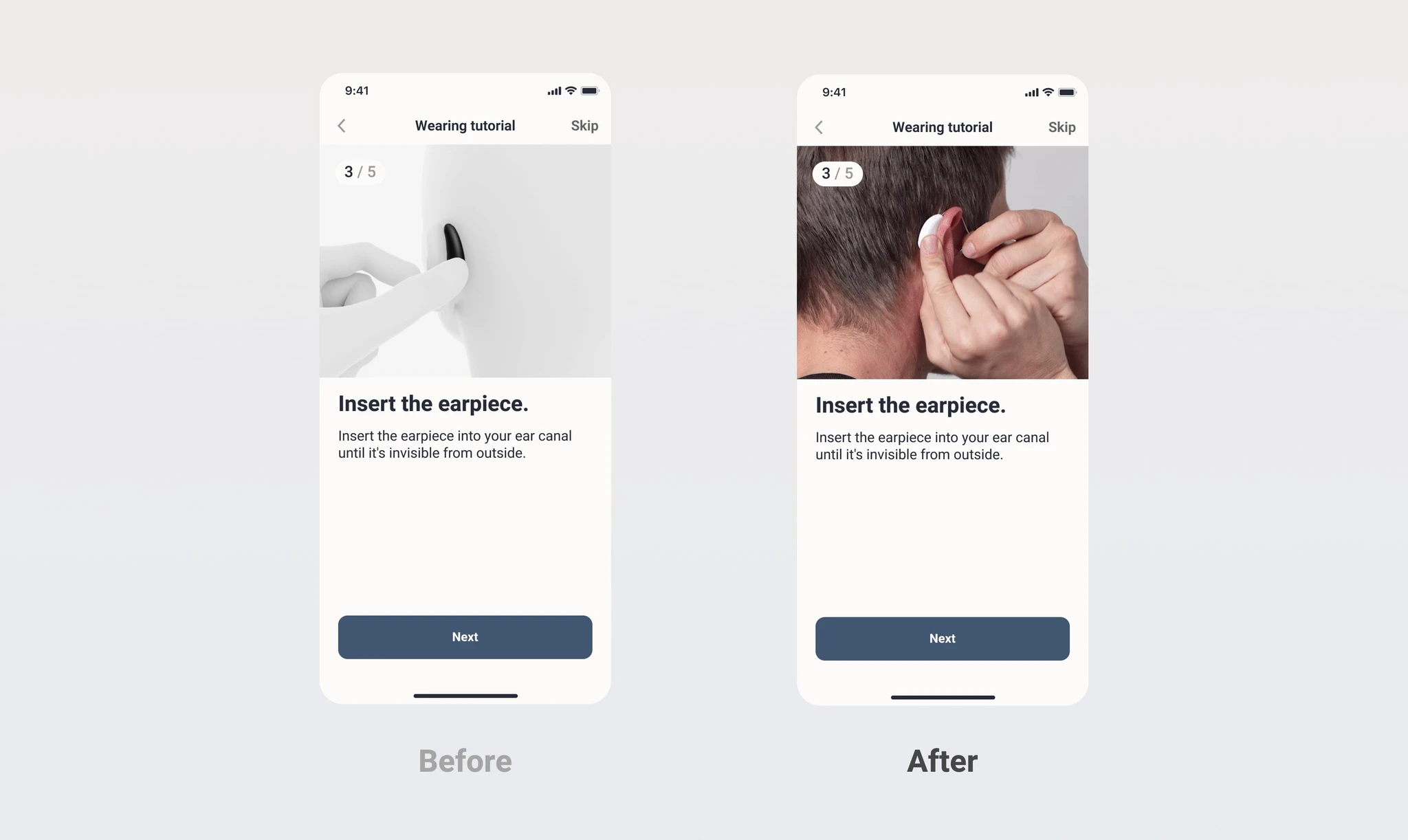
Wearing Tutorial
Step-by-step instructions so users never need to hunt for a how-to video or dig through a manual. Clear visuals, the right amount of words.
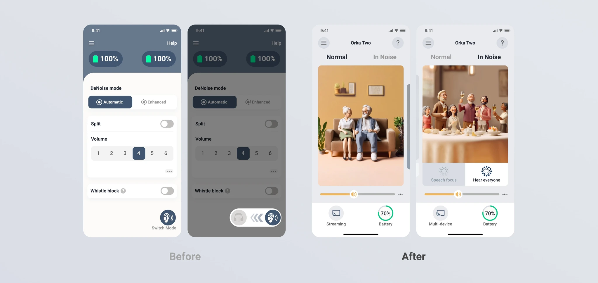
Everyday Benefits
Instead of technical specs, we showed users what the device would sound like in their actual life — restaurant conversations, morning birds, TV. Immersive scenarios, not audiogram charts.
Tailored Hearing Profile
A flow to schedule a remote fitting session with a professional audiologist — so users who needed more than self-service had a clear, accessible path to get it.
Want to see how it feels?
Tap through the onboarding prototype. It runs on ProtoPie, so interactions feel close to the real thing.
Try the prototype →Testing & iteration
First round failed on efficiency and experience. Second round passed everything.
We tested against four criteria: efficiency, user experience, consistency, and controllability. The first round told us clearly where the design fell short — efficiency and experience weren't there yet. We iterated, retested, and brought all four criteria to pass.
Outcome
A 5.3/7 satisfaction score and 25% of users giving full marks at launch
The US user survey after launch showed an average satisfaction score of 5.3 out of 7, with a quarter of respondents awarding the maximum score. For a first-time hearing aid user — in a category where returns are common — that's a meaningful signal that the experience landed.
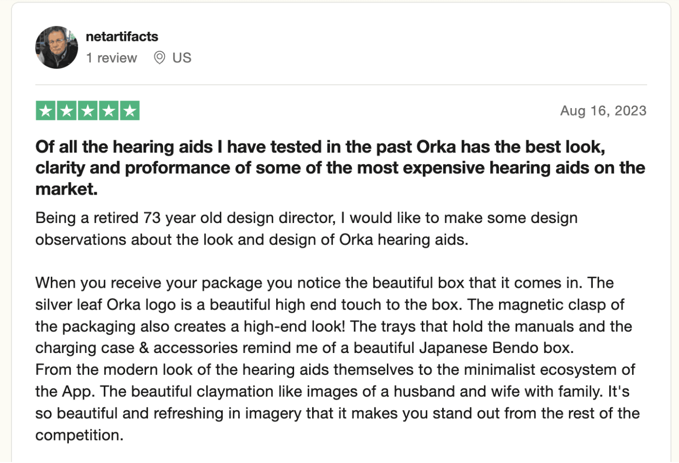
Unboxing from hearing aids experts: